Listen
I ran user interviews and reviewed past submissions with mentors. Mentees felt supported but overwhelmed, and the first submission was where most of them got stuck.
New mentees in a flagship virtual mentorship program valued the support but struggled to submit their first assignment. I led a redesign of the submission flow, and the program reached its highest completion rate.
Product lead, program content and user experience
Submission flow redesign
Programs team, mentors, Salesforce expert
Google Docs, Moodle, Salesforce
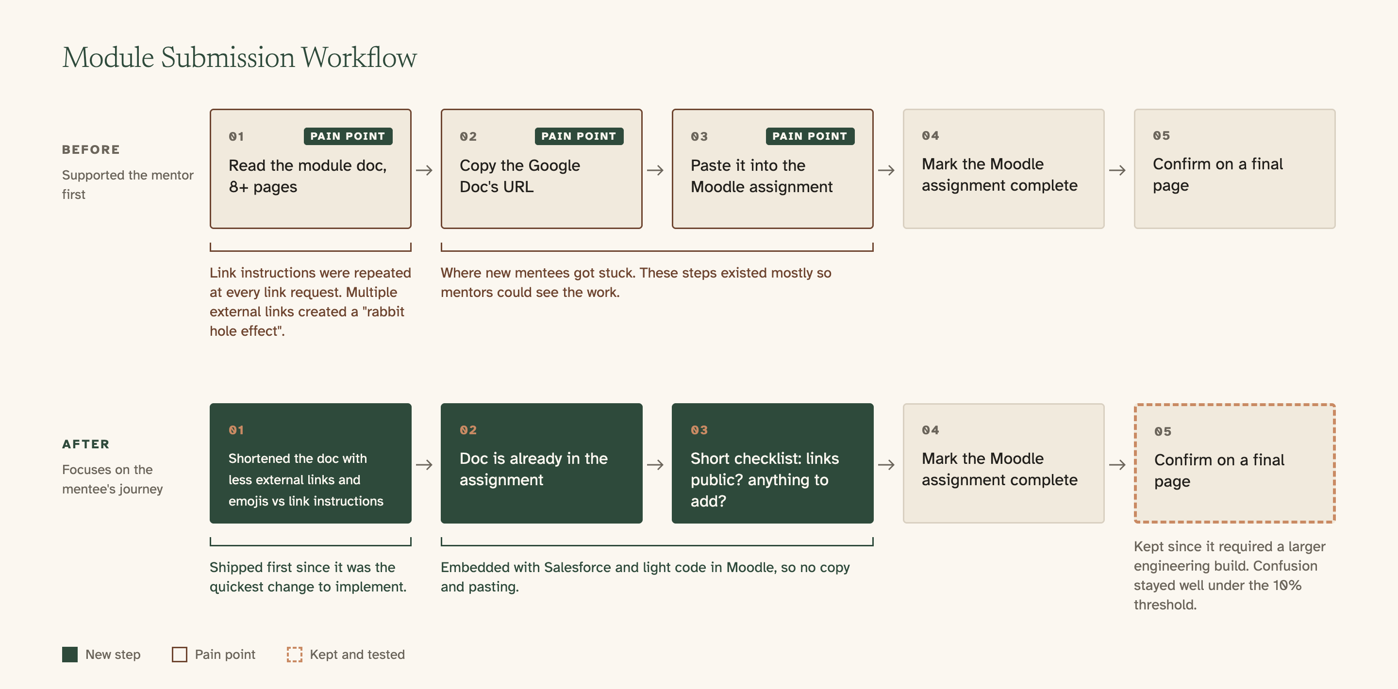
I owned the program's content and user experience, and the submission flow was where new mentees struggled most. The flow below shows each step before and after the redesign.
The copy-and-paste steps were there mostly for the mentor, who needed to see the work. For new mentees, they were the hardest part of the program.
I ran user interviews and reviewed past submissions with mentors. Mentees felt supported but overwhelmed, and the first submission was where most of them got stuck.
I kept the Google Doc and improved the flow around it. Replacing the doc would have pulled engineering time from a new, growing program, and mentees and mentors already knew Google Docs. I also shifted the design focus from the mentor, who was paid and already invested, to the new mentee.
I shipped the content changes first: one emoji note replaced the repeated link instructions, saving at least two pages per module. Then, with our Salesforce expert and some light HTML in Moodle, we embedded each mentee's document in their assignment and turned the submission page into a short checklist.
I wanted to remove the final confirmation page, but engineering constraints made that expensive. I kept it and set a success threshold: fewer than 10% of mentees could be confused, the most questions the team could handle. To track it, we reviewed Intercom tags and used AI to synthesize feedback from Salesforce, Intercom and email. Confusion stayed well below that threshold, so removing the page became a next slice instead of a blocker.
Highest completion rate.
Well under 10% of mentees confused about submitting, below the threshold the team set.
At least two pages cut from each module document.
What I learned: Prioritize new users' journeys to sustain growth, without reinventing the wheel.
Results here are directional. I am under a confidentiality agreement with this employer, so I describe the shape of the change rather than the underlying numbers or customer detail.